Nettio Designs

Design + Creativity + Adventure = LOVE

  • HOME
  • JOIN THE 2023 MONTHLY FAVES
  • THE SHOP
  • ABOUT
  • CONTACT
You are here: Home / Archives for Digital Scrapbooking

The Final Faves List of My Twenties

POSTED ON May 22, 2012 IN Life Adventures, Stuff I Love, the Faves

If you received the Nettio Designs newsletter over the weekend or saw my Sweet Shoppe Saturday blog post this week, you may have seen a little comment about this week being my “eek, I’m officially turning the big 3-0!” birthday week! Well, I’m turning 30 on Thursday, May 24th to be exact. Which means I still have a few days left before I’m officially a tech-lovin’ gal in her thirties. Eek, scary! I admit, I’m not totally sure how I feel about it just yet, haha, but hey, the show must go on, right?

So in celebration, I thought it was only fitting to spend a day or two saying goodbye to my twenties and what better way to remember birthday year 29 than with a Faves list?

After all, I’ve been creating them for half of my twenties already considering my 25 Faves at 25 was my very first Faves list ever…
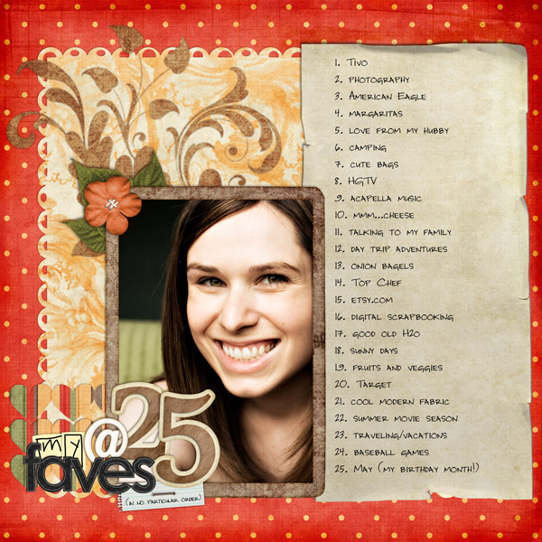
Dd88 meat25

And I did one for my 28 Faves at 28 list last year too…
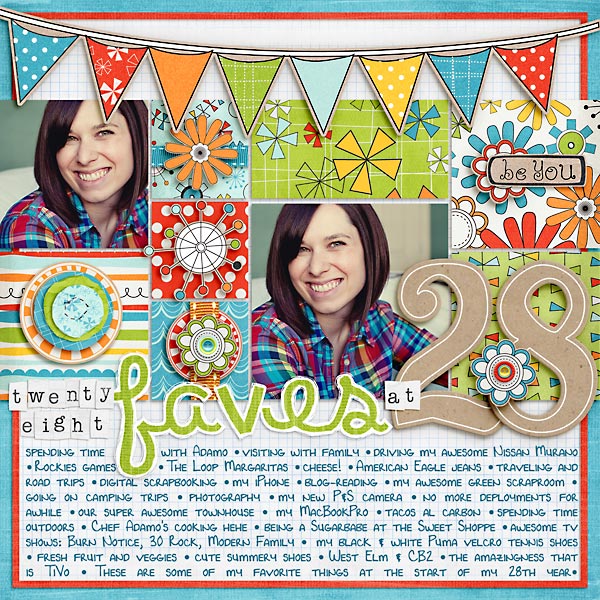
28favesat28

So I figured a new 29 Faves at 29 would be a nice way to capture this last year of my twenties, so without further ado, I give you my 29 Faves at 29 layout:
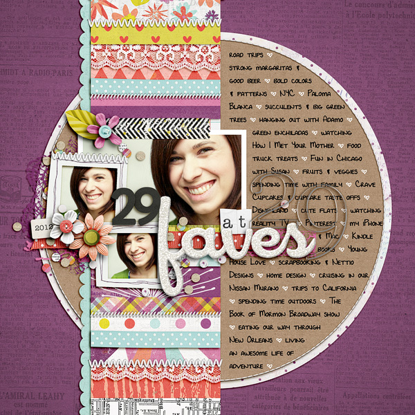
Nettio 17 29Favesat29

Anyone else ever done an age-inspired layout to celebrate a birthday? I have to say I love looking back at these layouts because it’s so fun to see what changes (so many of the 28 ones are Colorado specific!) and what stays the same (fresh fruit and veggies – woohoo for healthy eating!).
Fraudulent Drugs Are A Huge Global Problem

POSTED IN Life Adventures, Stuff I Love, the Faves, Digital Scrapbooking

How to Easily Choose a Kit to Go With Your Template and Photos

POSTED ON May 9, 2012 IN Tips from Team Awesome

Hello, hello and welcome to another installment of Tips from Team Awesome where the lovely ladies from my Creative Team share their most awesome scrapbooking tips and tricks. In today’s post, Inga is sharing a rather ingenious tip for how she chooses a kit to match her chosen template and photos. Take it away, Inga!

Hey fellow scrappers,

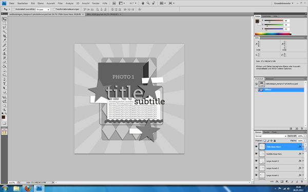
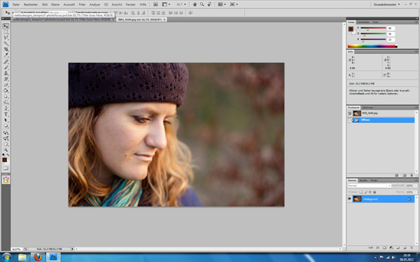
Today I’m going to share my little trick, how I check which kits go well with my images. I am a big template scrapper. So I usually pick my photos and a matching template first. In this case I had a relatively new portrait of my beautiful sister Maria. I also knew, I wanted to use a template from Lynnette’s newest re-release, Paper-tastic Vol. 2 (check it out here). I opened them both in Photoshop.

Image1

Image2

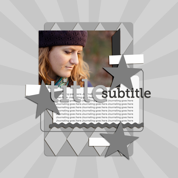
Then I put my photo in there and clipped it to the photo layer. I re-arranged the title elements and some embellishments to fit my needs better and show more of the image. But now came the difficult part: Which kit should I use?

Image3

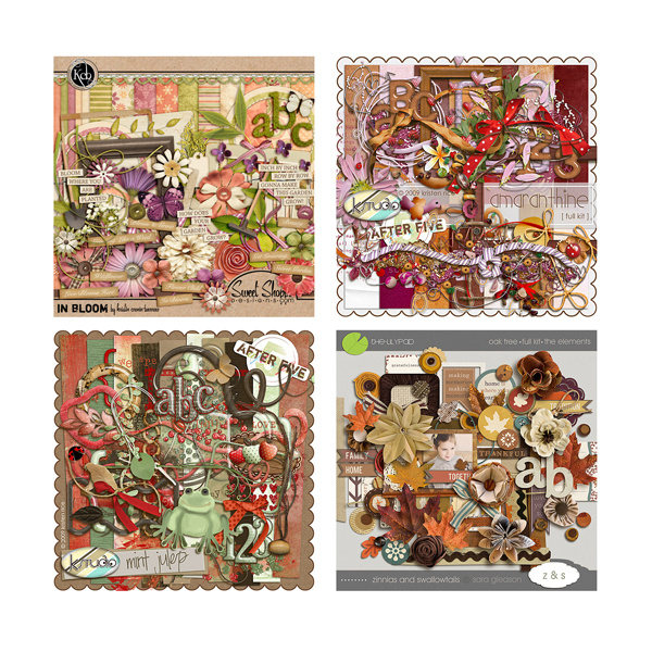
I have a pretty stash to choose from. The portrait was one I took over the Easter weekend. Using the first mild days with beautiful weather and golden light. A spring kit from the wonderful Kristin Cronin-Barrow came to mind. On the other hand her darker hat and the colours also reminded me of an autumn picture. I LOVE autumn kits and wouldn’t mind scrapping it with them. Those were practice portrait shots and not meant to capture a certain day. I narrowed it down to three additional kits, I could see me using here.

Image4

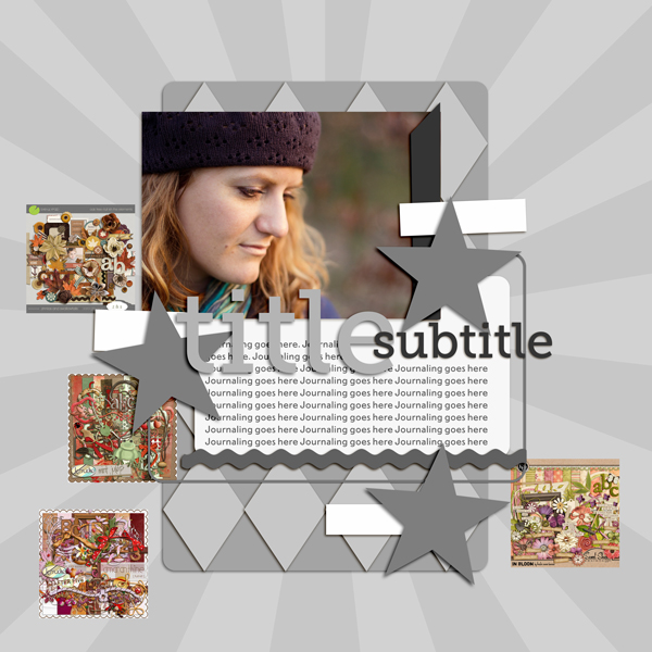
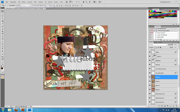
What to do? Whenever I am in a situation like that, my method is to do a quick check of all options. Here’s how. I simply drag all previews onto my template canvas. Yep, those tiny 600×600 pixels images. As you can see, they are pretty small.

Image5

So, I blew them them up by using transformation. When you do that, they will look incredible pixelated. Don’t worry, as soon as you confirm the transformation PS will adapt them. Mind you, they would look horrible now, if you zoomed in to 100%. But luckily you don’t need to do that. You just need a quick glance.

Image6

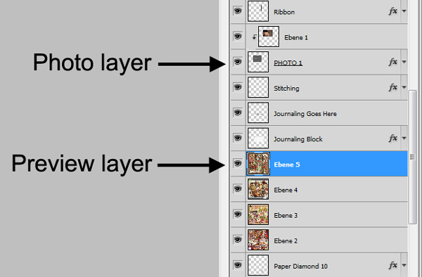
As you can see, I didn’t put them in right under the photo layer. I left the journal mat visible over them, so my photo doesn’t get lost completely in the preview. I usually look for a few layers between the previews and the photos. Sometimes it’s already enough to leave the photo frames visible.

Image7

Also, in this case I used the older completely grey version of this template. With coloured elements, I either turn them invisible, into grey shades or I just ignore the fact that their colours might throw me off a little bit.

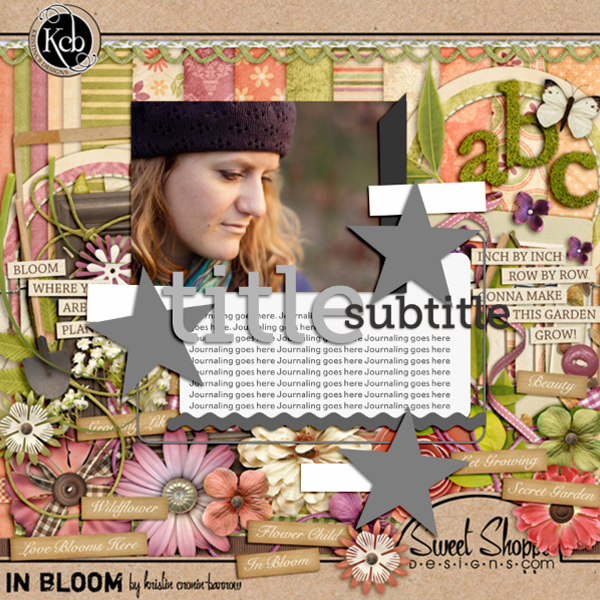
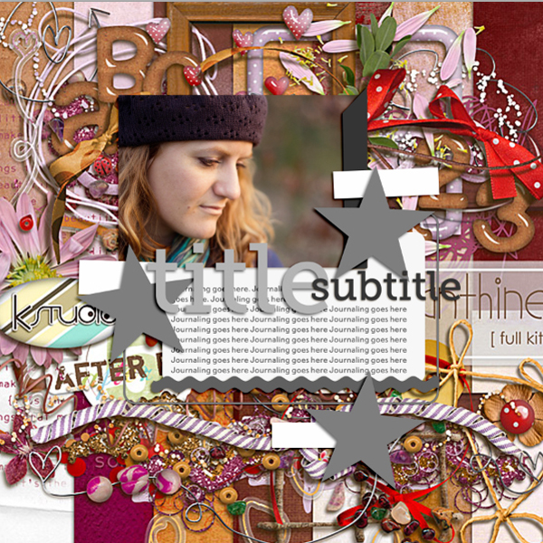
Now I turned the different preview layers visible/invisible as I went along and checked the overall look with each of them. Hey, my initial idea with the spring kit looked great!

Image8

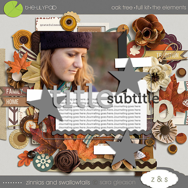
This would have worked perfectly as well.

Image9

This one? Not so much. An easy elimination.

Image10

I usually click through them back and forth, comparing how I feel about each kit. Very often I find a photo/kit combination that just clicks for me! That will give me exactly the look or atmosphere I envisioned. I also use this method, to check if bolder kit choices will work or not. So there you go, a quick and easy way to test your kits with your photos! I hope, you’ll find it useful.

Awesome tip, Inga! So smart! If you have a comment or question for Inga about this tip or anything else, feel free to leave a comment in the comments section of this post.

Kits included in this post are: In Bloom by Kristin Cronin-Barrow, Oak Tree by Sara Gleason and Mint Julep and Amaranthine, both by K Studio.

Want to pick up the Paper-tastic Vol. 2 template featured in this post? You can find it here at Sweet Shoppe Designs.

How Can Customers Lower Their Remedy Costs

POSTED IN Tips from Team Awesome, Digital Scrapbooking

WITL 2012: Perfectionism and the Magic of Capturing a Week In Your Life

POSTED ON April 24, 2012 IN A Week In the Life 2012

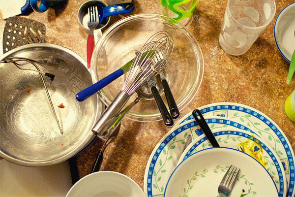
Nettio witl2012 dirtydishes

Why yes, that is a photo of dirty dishes on our counter…

A funny thing happened yesterday morning when I went out to our kitchen, camera in hand, ready to start capturing a week in our life. Two thoughts instantly ran through my head:

“I really wish I would have cleaned up a bit more yesterday.”

“We really should have hung some art on these walls.”

And I’ll admit for a split second I was tempted to grab my trusty hammer and nails and make things look extra pretty. And then I got over it.

Because here’s the thing, capturing a week in your life is not about perfection. It’s not about waiting until your house is photo-worthy or perfectly organized and neat and tidy.

Because that’s not real life.

Real life is crazy. Real life is messy. Real life is a pile of mail on the counter, your kids neon-colored toys strewn about the living room and yes, a pile of dirty dishes on the counter.

And capturing real life IS what Week In the Life is all about.

So if you’re one of those people out there thinking maybe you should wait to do Week In the Life until your life is a bit more photo-worthy or perfect, I ask you to reconsider. Because not only will that “perfect” week never come, but because the magic of Week In the Life isn’t about the individual photos.

It’s about the story those individual photos tell when you put them all together. 

And I promise you – once you see the big picture of your week all together, you won’t care about the less-than-perfect photos or the tiny details that seem like a big deal right now.

You will see your real life captured.

Dirty dishes and all.

And that is magic.

Nettio witl2012header small

Psst…I’m spending this week capturing a week in my life – find all my 2012 Week In the Life posts here. You can also find my 2011 WITL posts here. Want to know what this whole crazy Week In the Life thing is about? Get all the details here.

Can I take Levitra if I am taking other remedies at the same time

POSTED IN A Week In the Life 2012, Digital Scrapbooking

A Week In the Life 2012, Nettio Style

POSTED ON April 23, 2012 IN A Week In the Life 2012

Nettio witl2012header

Woohoo, the 2012 edition of Week In the Life is finally here and I couldn’t be more excited! As I’ve mentioned before, this project is definitely high on my faves list and my 2011 WITL photo book I created last year is one of my favorite scrapbooking projects ever. So I suspect it goes without saying that I’m totally on board with this project for this year.

But my biggest concern has been how can I make sure this album is different from last year? I mean, it hasn’t even been a year since I finished my album and as a family of two adults with no kids, it’s not like our lives are that different from last July. Well other than we aren’t melting quite as much here in Texas just yet, haha.

But I’ve come up with something I’m pretty excited about so here’s a little peek into my plan for Week In the Life 2012.

1) 7×7 Blurb Photo Book

I had such a great experience with Blurb for my photo book last year that I’ve decided to go with them again for this year. Only this time I’ve chosen to use their 7×7-inch Small Square book instead just to keep it interesting. But I’m still going to design it in Adobe InDesign like I did last year so it will also be a clean and modern design with the focus on photos and words since I loved how that look turned out so much last year.

2) A Mix of Instagram and Regular Photos

One of my concerns about doing WITL this year has been how can I push myself to make sure the photos this time are different from last time – that I’m not just taking photos of the same things from the same angle.

So while I’m not normally a huge Instagram user, I thought this would be a fun time to play around with it and see what kind of photos I can get. Plus it’ll cut down on the amount of photo editing I have to do when I’m putting the album together. I’ll still be taking some photos with my DSLR but I think the mix of photos will be a fun change from last year.

3) Focus on Topics rather than Days

One of the things I loved about my WITL album last year was the highlights pages I included in the end. So I’ve decided for this year to take those pages to the next level and really focus this week on capturing a more broad view of our life rather than a day to day play by play of what we’re doing. I think it’ll be a nice twist on my album from last year.

4) Capture Quotes

One thing I wished I’d done more of last year was capture more of our conversations so I’m going to be using my handy dandy notebook to try and capture some awesome quotables, hehe.

And that’s pretty much my plan at the moment! As with anything I’m sure it’ll evolve as the week goes on but I’m really excited to see how it turns out!

How about you? Anyone playing along with Week In the Life this week? I’d love to hear your plan!

And of course if you’re still in need of some Week In the Life templates, be sure to check out my Photo Book Frenzy templates in my shoppe here or at Sweet Shoppe Designs.

Want to know what this whole crazy Week In the Life thing is about? Learn more about Week In the Life here. You can also find my 2011 WITL posts here.

How Can Customers Lower Their Remedy Costs

POSTED IN A Week In the Life 2012, Digital Scrapbooking

Layout Love: 1st Quarter 2012

POSTED ON April 10, 2012 IN Memory Keeping, One Little Word, Stuff I Love

Well, it’s official. We’re one quarter of the way done with 2012. Only nine short months before the end of world, folks, are you ready?

I’ll be back later this week with an update on my 2012 Scrapbooking Resolutions  but in the meantime, I thought it would be fun to share a few of my favorite layouts I’ve done so far this year.

To be fair, it wasn’t really that hard to decide considering I’ve only digital scrapbooked a whopping 15 pages so far this year which I know, I know, most of you do that many layouts in your sleep. But hey, it’s been a busy year so far! And surprisingly that number actually puts me two layouts ahead of where I was at this time last year. That my friends, is progress.

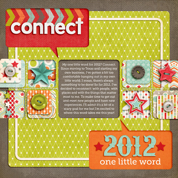
To kick things off I’m starting with the first layout I did this year, my One Little Word layout for 2012.

One Little Word 2012

I never really think to do photo-free layouts but every time I do them, I end up loving them. I especially love how the talk bubble cutouts came out on this one – I just want to reach out and touch them.

One For the Boys by Zoe Pearn; StraightLine Stitched No 2 by Anna Apnes; It’s Goal-tastic Template Pack by Nettio Designs; Font is Museo Slab
 

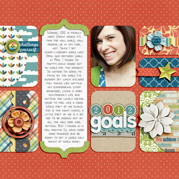
2012 Goals

I’m pretty sure I could do clean, blocked designs like this for the rest of my scrapbooking life and be perfectly happy. I just love the clean lines and all the little homes for the elements. Plus this kit is pretty much a combination of my favorite colors in the whole world which is why my outfit ended up perfectly matching despite being completely unplanned. 
I Can by Shawna Clingerman; Alpha from One for the Boys by Zoe Pearn; It’s Goal-tastic Templates by Nettio Designs; Font is DJB 4 Lynnette by Darcy Baldwin
 

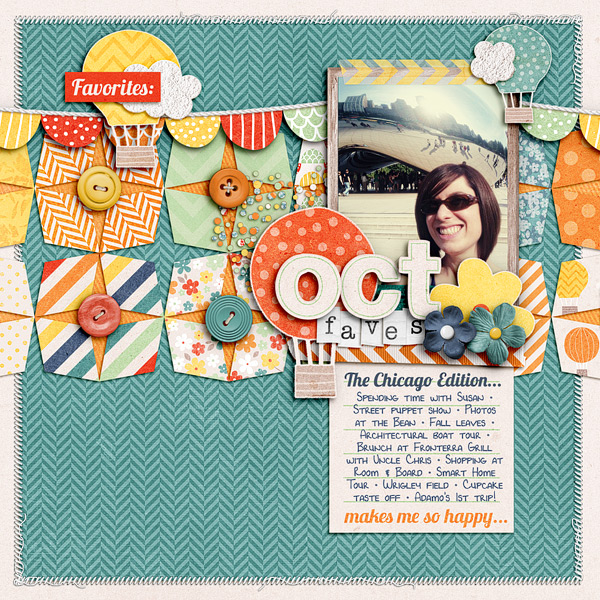
October 2011 Faves

Aww, repeating shapes, how I love thee. The shapes on this page were actually inspired by a design I saw on Pinterest – I love that they’re geometric but still a little wonky. And of course, a Chicago layout (with photos of the Bean, no less) is always a good time because it means I got to hang out with my sis who’s a grad student there.

Happiness Is… by Zoe Pearn; Teeny Type Alpha (retired) by Zoe Pearn; Font is DJB 4 Lynnette by Darcy Baldwin; FAVE-O-RITES Vol. 5 Templates by Nettio Designs
 

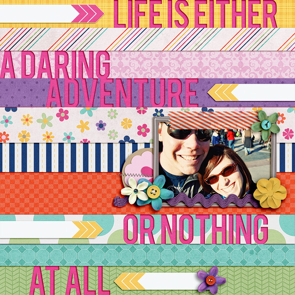
Life is an Adventure

I can’t remember where the inspiration for this layout came from but this was one of those pages that just flowed. Like you come up with the idea and wham, what feels like seconds later, you’ve got an awesome layout you love. That doesn’t happen to me all that often so when it does I’m always amazed. But I love how bold and colorful it is and the cutout title of my life motto is one of my fave trends of the moment.

Life’s An Adventure by Penny Springmann and Becca Bonneville; Font is Bebas
 

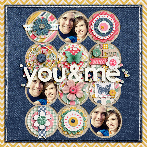
You & Me

This layout is actually a redesign of another older less-loved layout of mine (more on that another day) but I LOVE how it turned out this time. Zoe’s kits always rock my socks and this one was no exception. I would so wallpaper my house in those yellow chevrons if I could. Plus the elements in this kit were to die for – it was so fun to just layer and play.

Credits: Lost & Found by Zoe Pearn; Ginormous Single Stitches Facebook Freebie by Traci Reed; Alpha from Love Birds by Zoe Pearn and Shawna Clingermann; Straight Line Stitching by Anna Apnes; Round N Round Vol. 1 Template Freebie by Nettio Designs
 

Now It’s Your Turn

Well those are some of my favorite layouts from 2012 so far! Now I want to know…

What’s one of your favorite layouts from 2012?

I’d love to see so link me up in the comments and I’ll leave ya some love!

How do I purchase Levitra without going to the doctor

POSTED IN Memory Keeping, One Little Word, Stuff I Love, Digital Scrapbooking, Template-y Goodness

Why I Switched From Adobe Lightroom to Apple Aperture

POSTED ON March 23, 2012 IN Stuff I Love, The Great Computer Spring Clean-a-thon 2012

Happy Great Spring Clean-a-thon Day 5 everyone! Today’s post is perhaps a bit too specific for the Clean-a-thon being that it’s both Mac-specific and highly based on my own personal experience, but because one of my goals for this week was to organize my photos in Aperture, this seemed like a good time to write this much overdue post about why I decided to make the switch from Adobe Lightroom to Apple Aperture.

A few things to note before we get started:

1) Aperture is designed by Apple which means it’s Mac only. My apologies in advance to any of you PC users since this post will probably not be quite as useful for you as I would like.

2) My experience is based off Lightroom 2 and Aperture 3. But other than lens correction, I haven’t seen any features in Lightroom 3 or 4 that have made me regret my decision.

3) I am not a professional photographer. I have no desire to be a professional photographer. So if you are one or hope to be one, your needs are likely different than mine. This is just my opinion based off my needs as a tech-lovin’ digital scrapbooker.

Ok, so with that in mind, here we go…

Why I Decided To Switch To Aperture

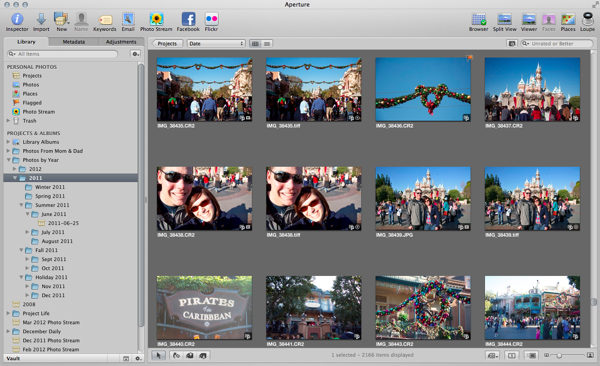
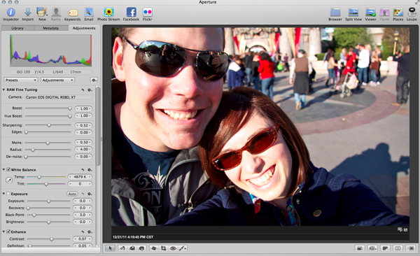
Nettio aperture

Last summer, I decided it was high time I get my photos in order. At the time I was planning to start Project Life as one of my 29th birthday goals and I knew in order to keep up with it, I would need an easy way to manage my photos. Up to that point I had been using Lightroom for organizing and editing all of my photos in tandem with Photoshop and while I liked it, there was something about it that never felt quite right to me.

Yes, I understood how it worked. Yes, I could organize and edit my photos and get good results. But I didn’t enjoy using it.

For one, I found the module design to be overly clunky. While I’m sure it’s fantastic when you’re editing 100s of photos from a shoot in a linear fashion, I never do and so even with shortcut keys, I found it annoying to switch between modules all the time. I especially found the separation between folders, collections, smart collections and tags made it difficult to organize everything easily in a way that made sense to me.

So when Apple announced they were lowering the price of Aperture to less than what it would cost me to upgrade to Lightroom 3, I decided to download the 30-day trial and give it a shot.

And I have to tell you, I was sold from day 1.

  • I LOVED the simplicity of the interface. In fact, it was almost one of those, that’s really all I need to do? kind of moments. It seemed overly easy compared to Lightroom.
  • I could organize, tag and edit my photos all in the same window. It was quick and easy to switch from a slideshow to a folder to a smart collection and I could group them all together in one spot.
  • I was getting better edits out of my photos with less work and the colors in the photos popped in a way I could never get them to do in Lightroom.
  • Even though it’s not an Adobe product, I was still able to easily open my photos in Adobe Photoshop for more editing.
  • I love the integration it has with my Mac. Auto-downloading of iPhone photos? Yes please.


It all just felt so much less complicated and better suited to my needs as a scrapbooker.

No, Aperture is not perfect. I find it runs slower than Lightroom 2 on my almost 4 year-old MacBookPro (although I suspect the same would be true for LR 3 & 4. Poor compy is just getting to that age.). I find the import options, especially when it comes to renaming files and not importing duplicates, to be more robust in Lightroom. And I think having built-in lens correction for lens distortion, etc., would be really handy to have.

But ultimately, I’m willing to deal those issues in exchange for the overall experience of using Aperture. Because I enjoy using it in a way I never enjoyed using Lightroom. Much like how I felt when I originally switched from a PC to a Mac.

Which ultimately is what I think this debate boils down to. In much the same way as the never-ending Mac vs PC debate, it ultimately comes down to personal preference. Both Lightroom and Aperture are amazing programs. They’ll get you where you need to go.

But which one works best with the way your brain works? For me, that’s Aperture.

Anyway, I realize this is a highly untechnical review of a largely technical program, but I realized when I sat down to write about why I switched, it wasn’t because of any tech specs or specific features. It was the overall experience and flow of the program that sold me.

So if you’re a Mac user, check it out or download the trial and give it a try! If you like it great, if not, Lightroom is a pretty awesome program too. And if you’re an iPhoto user, Aperture is kind of like iPhoto advanced but you can read more about the differences here.

Well I hoped you enjoyed this little insight into why I made the switch from Lightroom to Aperture! As always, if you have any questions, feel free to ask them in the comments.

Can diabetes cause erectile dysfunction

POSTED IN Stuff I Love, The Great Computer Spring Clean-a-thon 2012, Digital Scrapbooking

  • « Previous Page
  • 1
  • 2
  • 3
  • 4
  • …
  • 7
  • Next Page »
HI I'M LYNNETTE. Graphic designer, tech-lovin’ memory keeper and lover of bold colors & patterns, good food and the great outdoors. Here at Nettio Designs, I share a behind the scenes peek at my own creative & life adventures. Read more...

KICKSTART YOUR CREATIVITY


By popular demand, photo book templates are back! Grab all three sets in the shop.
ADVENTURES IN ORGANIZING
GOAL-SETTING
MEMORY KEEPING
PROJECT LOVE
LIFE ADVENTURES
TIPS & TRICKS
BEHIND THE SCENES

POPULAR PROJECTS

TO SEE ALL MY PROJECTS, CLICK HERE

MUST READ POSTS

  • WHY EVERY SCRAPPER SHOULD SCRAP A FAVES PAGE
  • HOW TO CREATE A SCRAP-WORTHY MAP WITH PHOTOSHOP
  • REMEMBERING THE IMPORTANCE OF TELLING YOUR STORY
  • WHAT DOES IT MEAN TO CREATIVELY CAPTURE YOUR LIFE ADVENTURES?
  • BROWSE BY CATEGORY

    BROWSE THE ARCHIVES

    GET IT FOR FREE

    Copyright © 2025 ·Dynamik Website Builder · Genesis Framework by StudioPress · WordPress · Log in