Nettio Designs

Design + Creativity + Adventure = LOVE

  • HOME
  • JOIN THE 2023 MONTHLY FAVES
  • THE SHOP
  • ABOUT
  • CONTACT
You are here: Home / Archives for Digital Scrapbooking

How To Design Type For Your 10 Things I Love About You Mini Book

POSTED ON February 5, 2013 IN 10 Things I Love Mini, Memory Keeping

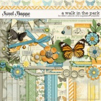
Over the weekend at Sweet Shoppe Designs I released my 10 Things I Love About You Mini Photo Book Templates based on my Valentine’s Day mini photo book I wrote about last week. One of my favorite things about this album are the text-based pages. Not only are they the bread & butter of the book’s sentiment but they’re fun to design as well! So today I wanted to share a little tutorial about how I styled the text in my 10 Things I Love About You album.

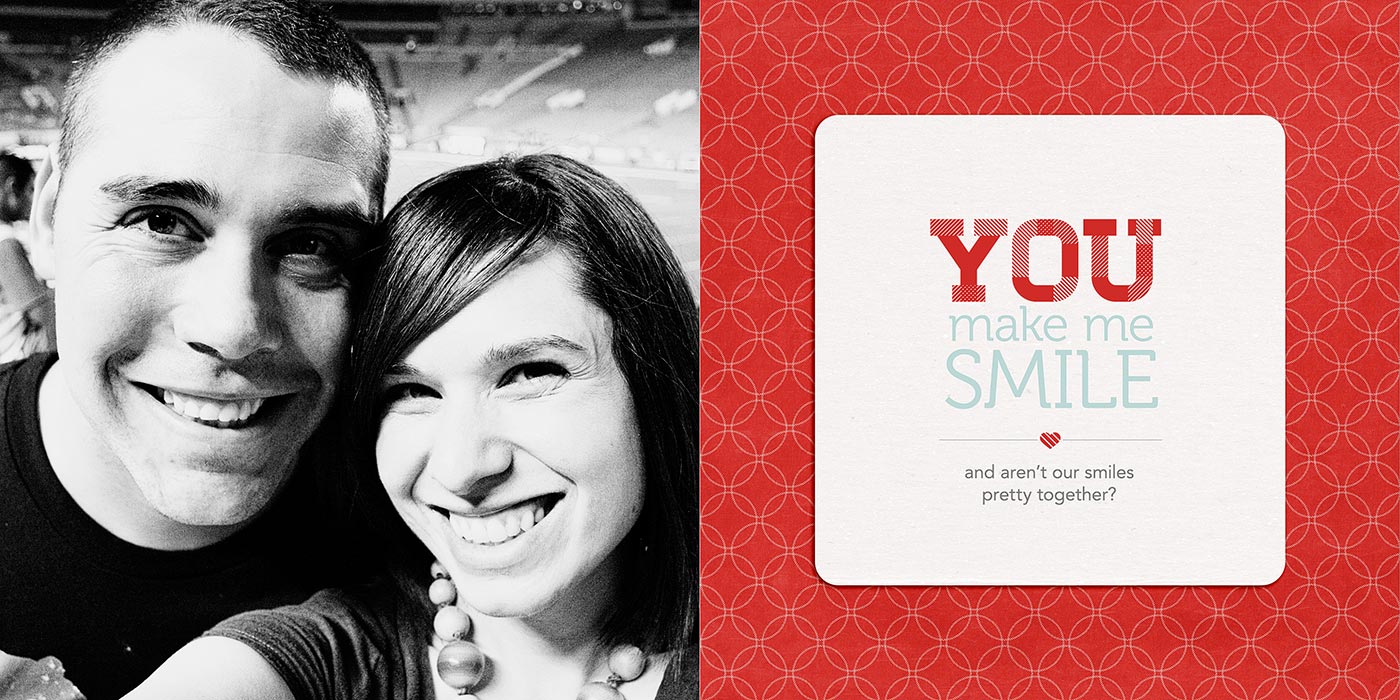
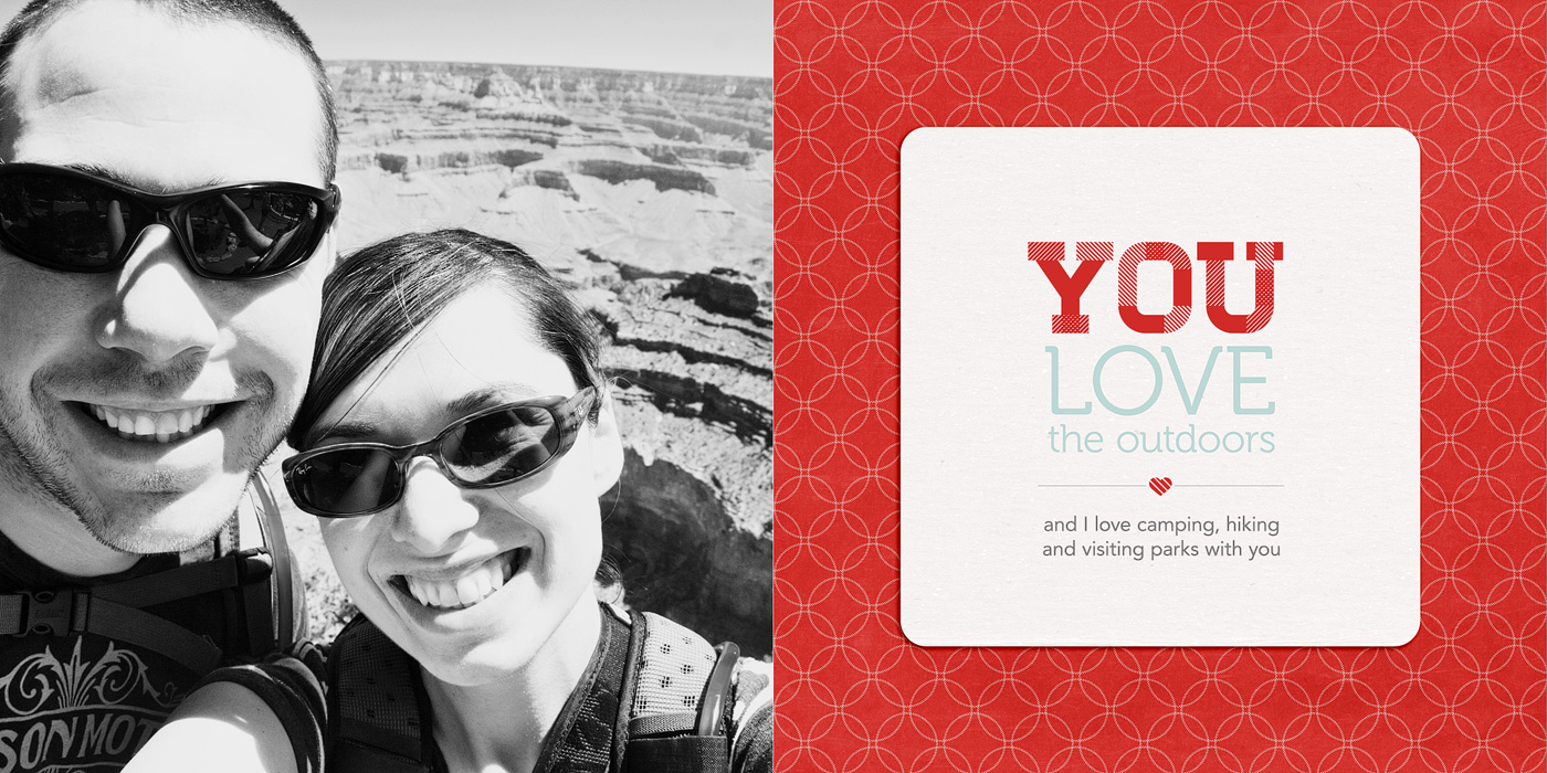
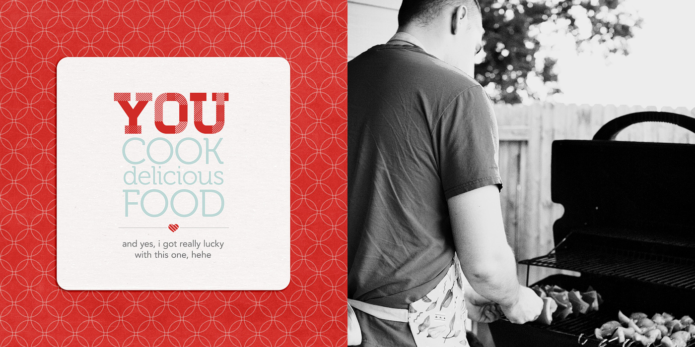
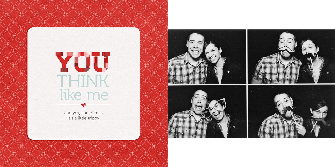
Here’s a look at the text in one of the spreads in my album. In this tutorial I’m going to show you how I designed the title & journaling on the right page.

Nettio 10Things Text Tut Completed Page

Here’s a little closer look at the text:

And here’s how I designed the text…

Step 1: Open the template file. It’ll look like this. The large YOU text is included as part of the template but the area below is left blank for you to fill with your own sentiment.

Nettio 10Things Text Tut Step1

Step 2: Turn on your Rulers if they aren’t on already. Ctrl/Cmd+R will turn them on for you or you can go to View>Rulers in the menu bar. They should show up around the edges of your window.

Step 3: Drag two guidelines out from the rulers – one to the left side of the bottom of the Y and one to the right side of the U. These are going to be your guides for aligning your text.

Nettio 10Things Text Tut Step3

Here’s a closer look. Notice the left guide is lined up with the bottom left edge of the Y, not the top left edge of the Y.

Nettio 10Things Text Tut Step3b

Step 4: Decide what phrase you want to use for your text. I used a post-it note to write down a list of general ideas and then tweaked my exact wording once I was in Photoshop. Keep in mind that for the design, we will be splitting the text into multiple lines, so it tends to work best with a phrase that has some more & less important words as part of it.

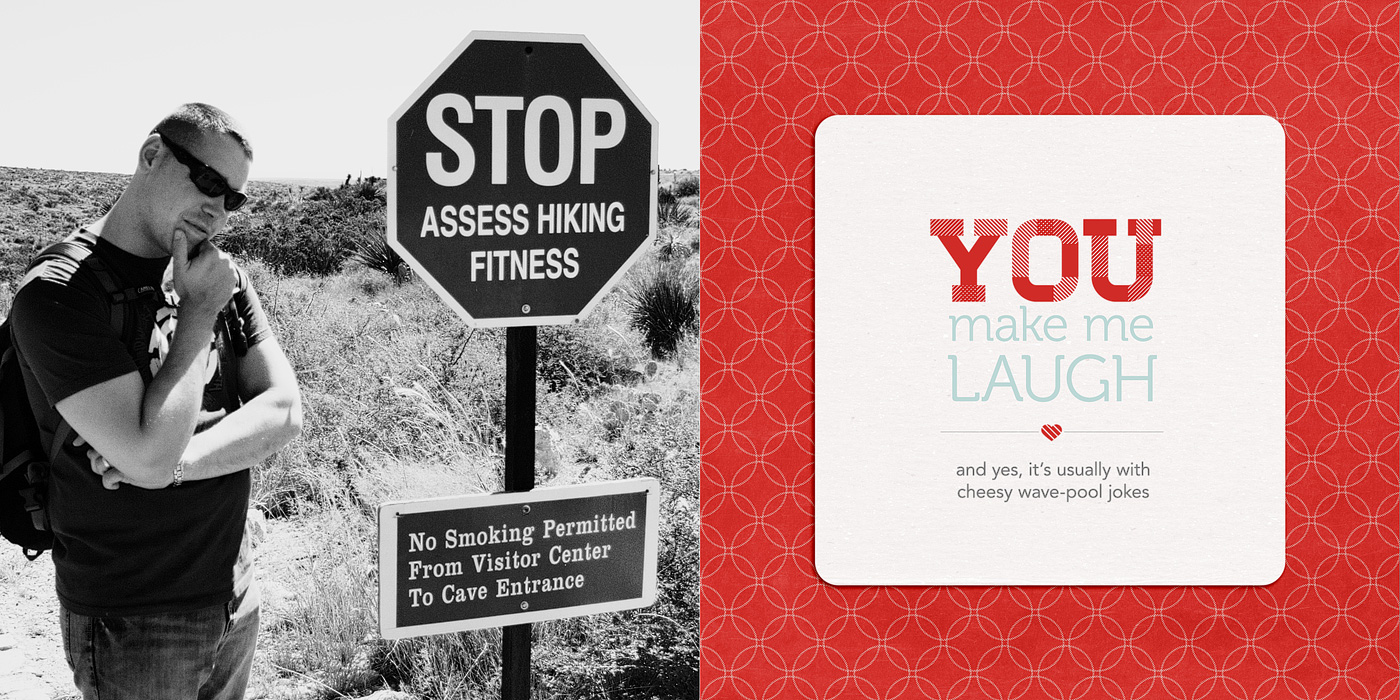
For this example I’m going to use “You make me laugh.”

Step 5: Type your text into photoshop, dividing it in to multiple lines as you go. Don’t worry too much right now about which words goes onto which line since we can change it in the next step. Just get all the words in there so you can see what you have to work with.

For my album I used the font Museo which can be downloaded for free here.

Nettio 10Things Text Tut Step5a

Quick tip: An easy way to create multiple lines of text to type the first half of your phrase first, duplicate that layer (Ctrl/Cmd+J or hold the Alt key & drag) and then replace the text in the duplicated layer with the second half of your phrase. If you need an additional line, you can repeat this process.

Nettio 10Things Text Tut Step5b

Nettio 10Things Text Tut Step5c

Step 6: Nudge your text layers so the left edge of your text lines up with the left guideline.

Nettio 10Things Text Tut Step6

Step 7: Decide on the word (or words) you want to emphasize. For my example I chose to emphasize the word “laugh.”

Quick tip: If you’re having a hard time deciding what word you want to emphasize, try saying your phrase out loud, paying attention to which words you naturally emphasize when you speak. Yes it’ll feel silly, haha, but it helps!

Step 7: Select the text layer of the word you want to emphasize with your Text tool (T) and retype your word in all caps.

Nettio 10Things Text Tut Step7

Step 8: With your text tool still selected, hit Ctrl/Cmd+T on your keyboard to Transform the text so the right edge lines up with the right guideline we drew earlier. Depending on the word you chose, you’ll be sizing your text larger or smaller. Once you’re done transforming your text hit the enter key.

Nettio 10Things Text Tut Step8

Step 9: Now we’re going to do the same thing with the text we want to demphasize. Select the text layer for the text in the Layers panel and with your Text tool selected, Transform your text (Ctrl/Cmd+T) so it lines up with the right guideline. If you have more than 2 lines of text in your phrase, repeat this step for each line of text.

Nettio 10Things Text Tut Step9

Step 10: Turn off your guidelines (Ctrl/Cmd+;), take a look at your text and see how you’re liking it.

Quick Tip: This is the point in the process where it may take a little trial and error to get a look you like. Try different combinations of words, caps vs no-caps or separating your lines of text differently. Sometimes all it’ll take is a little nudge of the words up or down or right or left to get it to look good to your eye. I usually end up turning the guidelines on and off a few times until I get a look I like.

Nettio 10Things Text Tut Step10

I’m liking how this looks so I’m going to move on to the next step.

Step 11: Once you have your main title text placed the way you would like, add in your additional journaling below the heart accent line and adjust the spacing between the text as needed.

Since my phrase was fairly short, I moved my accent and journaling up just a tad so everything was evenly spaced. If your phrase is long, you may need to move the entire block up text up just a smidge to keep it centered vertical in the journaling block.

Nettio 10Things Text Tut Step11a

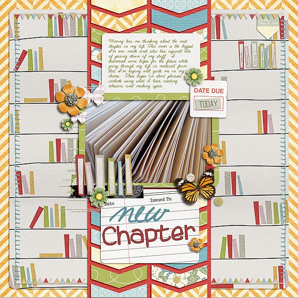
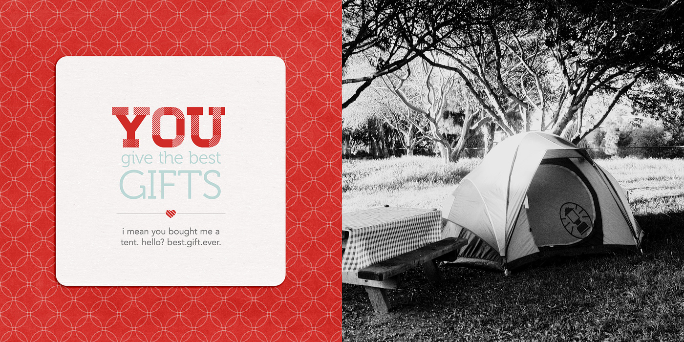
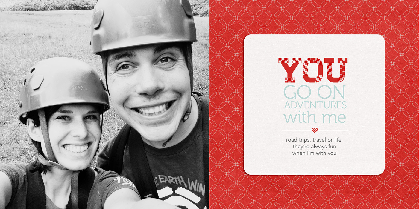
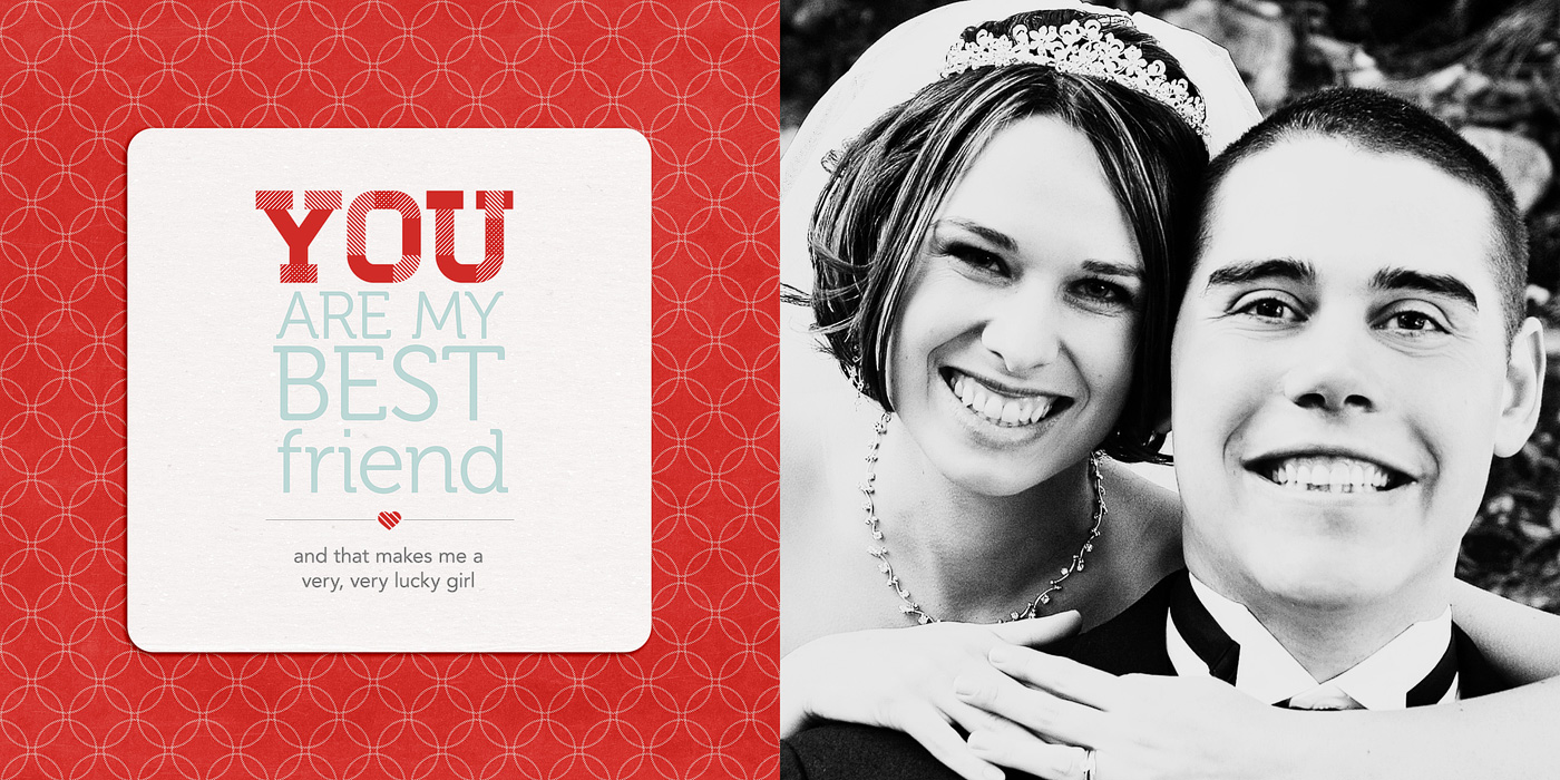
And here’s what my completed page looked like once I added my photo and papers:

Nettio 10Things Text Tut Step11c

A closer look at the text page:

Nettio VDayMini 21No5Text

And my full completed page as printed:

Nettio 10Things Text Tut Completed Page

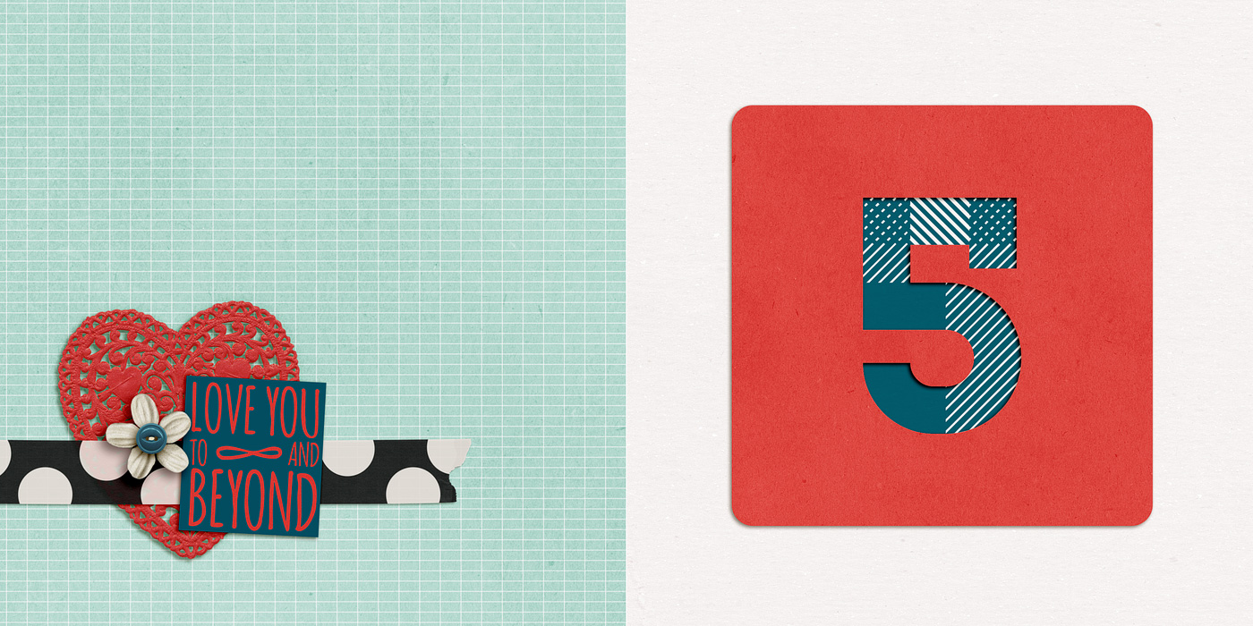
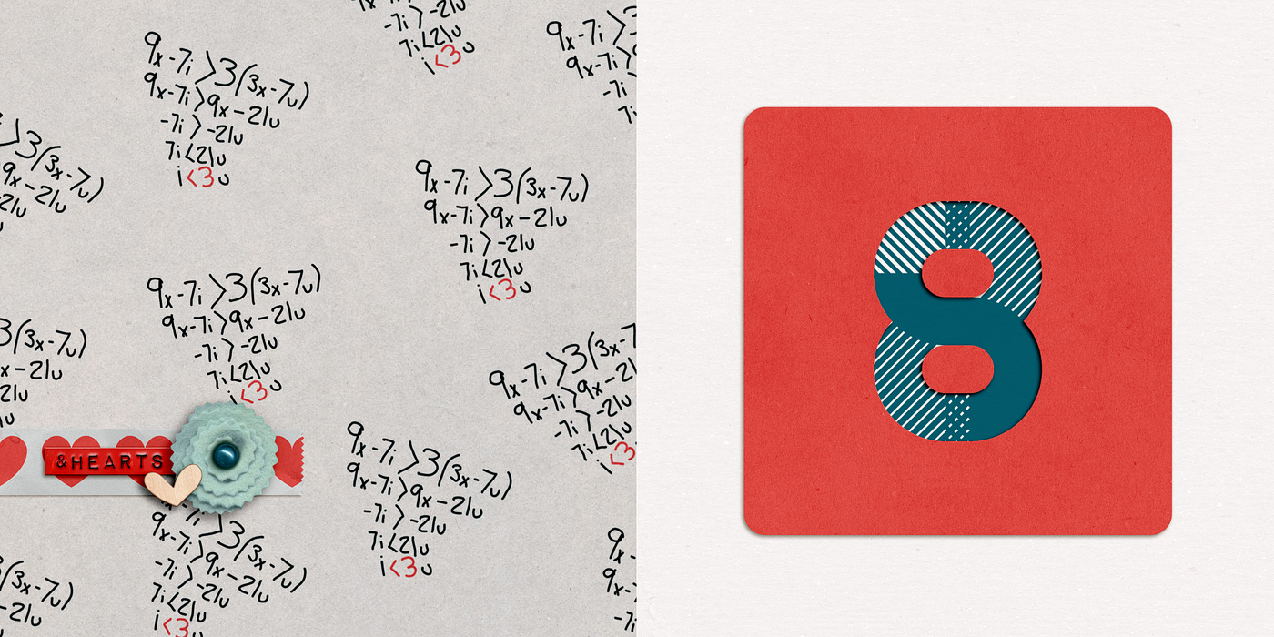
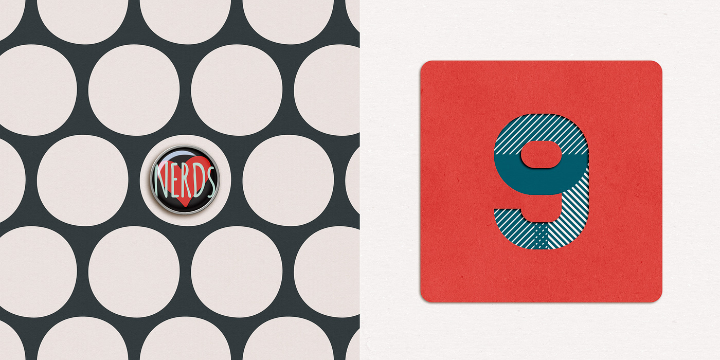
Of course if you’d like to add your text using something other than a font say like a digital alpha, here’s a great example from Team Awesome member Jen using the alpha from Talk Nerdy To Me:

Fun, right? I hope this gives you some tips & ideas for designing and styling your own mini book text. And of course, if you’d like to make your own version of this lovey-dovey mini, you can pick up the 10 Things I Love About You Mini Photo Book templates right here.

Any questions about this tutorial? Feel free to ask away in the comments section below and I’ll be happy to help you out.

Fraudulent Drugs Are A Huge Global Problem

POSTED IN 10 Things I Love Mini, Memory Keeping, Digital Scrapbooking, Hybrid Scrapbooking, Mini Albums, Template-y Goodness, Tips & Tricks

Creative Adventure #5: Designing a Hybrid Mini Photo Book With Photoshop

POSTED ON January 31, 2013 IN 10 Things I Love Mini, 30 Creative Adventures, Memory Keeping

I’ve known since the beginning of this 30 Creative Adventures project that one of the projects I wanted to do was another photo book. I had designed one once before for my Week In the Life album in 2011 and I thought it’d be a fun challenge to do another one.

And since I designed my WITL photo book using Adobe InDesign the first time around, I thought I’d give designing a book in Adobe Photoshop a try since I know that’s what most of you use and I was curious to see how the process works for you.

Let me just preface this post by saying, designing a photo book in InDesign? WAY easier than using Photoshop. Seriously. But I survived and am so very in love with my completed mini photo book that all the hard work was worth it.

Which brings me to Creative Adventure #5: Designing A Hybrid Mini Photo Book With Photoshop

Creative Adventure #5: Designing A Hybrid Mini Photo Book With Photoshop

Nettio CA5 VDayMini title 1400

Step 1: Planning My Mini Photo Book

When I started this project, here were a few things I knew:

  • I wanted to use Photoshop to design my book, as I mentioned
  • I wanted to do something smaller, like a 6×6 or 5×5 book as opposed to the 8×10 book I did for WITL
  • I didn’t want to pay a fortune to have it printed

Since Valentine’s Day was coming up, I thought it’d be fun to make a little book as a gift for Adam. So I came up with the idea to do a 10 Things I Love About You mini book because a) I love lists and b) it seemed like it’d be fun to design.

After drawing up some sketches, I decided I wanted to go with a repeating pattern of 2-page spreads: an accent/number spread and a full photo/text spread using the word YOU as the focus for the text.

So I made a little mockup version on scratch paper to see how it would work:

Nettio Valentine Mini Photo Book Sketch1

Nettio Valentine Mini Photo Book Sketch2

Then I drew out a bigger version of all the pages I would need since I wanted to make sure whatever printer I used could handle the number. I also decided to keep all the number pages on the right side of the spreads but I wanted the photos/text to alternate with every other number like so:

Nettio Valentine Mini Photo Book Sketch3

Super high-tech, I know, haha. But I find it really helps to give me a feel for sizing and/or the flow of the book.

Once I had a general feel for the design of the book, I went on the hunt for a kit that would work with my design. As soon as I saw this super adorable Talk Nerdy To Me kit from Penny at Sweet Shoppe Designs, I knew we had a winner. A+L definitely equals nerdiness, haha.

Pspringtmd talknerdytome preview

The final planning decision I needed to make to decide on a final size and book printer. I like to do this before I design any actual pages since the final size of a printed book varies depending on the printer and this way I can account for any bleed/trim since every book publisher does things a little differently.

After looking around a bit, I finally settled on an Mpix 5×5 Hardcover book (it’s under their Coffee Table Books in the left sidebar). A huge selling point for me was they had templates I could download to make sure I got the sizing just right and their books were reasonably priced:

Nettio CA5 VDayMini Step1

Step 2: Prepping My Mini Photo Book

Since I like to design two-page spreads as a single file, I used the 5×5 page template to make a single 5×10 document. The actual size ended up being around 5.25 x 10.5 since their 5×5 pages are actually 5.253 x 5.253. This is why checking the sizing for the book printer you want to use is so important before you start – because it’s much easier to design your pages correctly the first time than it is to make adjustments later on, especially if you want full-bleed (images going all the way to the edge) pages which I did.

Nettio CA5 VDayMini mpix2page

Once I had my two-page template made I made two master templates: one for the accent & number page and one for the photo & text page.

Nettio CA5 VDayMini Step2

Then I duplicated and renamed all those files to represent each spread in the book. This is basically the same exact process I would use in InDesign: design master pages first and then duplicate them as a template for all the following pages. But in InDesign it’s much simpler since all these pages are in a single document. Since I was using Photoshop this time around, I had to make all the pages by hand as individual files. #sotedius

Nettio CA5 VDayMini Step3

Step 3: Designing My Mini Photo Book

But once I finally had all the planning out of the way, now came the fun part: designing the book! This was the easy part, haha.

Nettio CA5 VDayMini Step4

Since I was trying to keep this a secret from Adam, I designed all the accent & number pages one night while we watched TV (I just told him I was making a mini book) and then I did all the photo & text pages while he was at work one morning.

Here’s what the pages looked like once I had them completed:

Nettio CA5 VDayMini Step5

And here’s a bigger version of the two spreads for Reason #1. Each “reason” basically gets 4 pages.

Accent & Number page:

02 03 Number1 700

Photo and text page:

04 05 Number1Text 700

Here’s a little slideshow that includes all my pages in case you want to see them all together…

Step 5: Printing My Mini Photo Book

Once I had all my pages designed, the next step was to save and upload them to be printed. Which meant cropping each two-page spread back into single files. Blah. Not my favorite part of the process but a bit of a necessary evil I think since designing the pages together makes more sense than as separate files. But it definitely made me long for the “upload a single PDF to Blurb” process I did with my Week In the Life photo book, haha.


Nettio CA5 VDayMini Step6

Thankfully, one of the fastest parts of the process was uploading my pages to Mpix. Two thumbs up for their online software because it was really easy to use. Just upload your images, drag them onto the pages of the book and set them as a background. My pages all fit perfectly since I’d used their sizing template when I designed them.

I did run into some issues getting the cover just right but I think that was more due to user error. Once I went back and double-checked my page against their template, it worked fine.

Screen Shot 2013 01 30 at 3 38 24 PM

Step 6: Receiving My Mini Photo Book

Another huge positive for Mpix, they printed SUPER fast. Like within a day or two my book had shipped. And since I’d paid for 1-day shipping since I wasn’t sure how long the process would take, my book arrived in like 3 days. I was amazed.

And even better, I’m really happy with how my mini photo book turned out!

Here’s a look at the cover. I went with the custom 5×5-inch hardcover book and it’s nice and sturdy – sturdier than the cover of my Blurb photo book. Plus I love that it has a glossy finish to it. Adam’s comment when it saw it was that it looked like I’d had a real book published.

Nettio Valentine Mini Photo Book 1

A look at the interior pages. The one thing I don’t love is the binding on the book is really tight, almost too tight. It’s hard to keep the pages open and it makes me nervous to pull the book open too far because you can start to see the stitching at that point. It also made taking these photos a bit interesting, haha.

Nettio Valentine Mini Photo Book 11

A look at one of the photo/text pages. The actual color is more rich and less saturated than this photo – it’s looking a little crazy here, haha.

Nettio Valentine Mini Photo Book 2

I do love the way the cover design wraps around the edges of the book. Makes it seem legit, haha.

Nettio Valentine Mini Photo Book 3

Another photo/text page, this time with the text on the left & the photo on the right.

Nettio Valentine Mini Photo Book 5

This page may just be my favorite. The photos make me laugh every time. And no, other than saying things like “let’s do a normal one first” or “silly face” the poses were not planned. Apparently “silly face” means “mouth opened really wide & crazy” to both Adam and I, haha.

Nettio Valentine Mini Photo Book 9

A closer look at the book. This is a good example of how far you can open the book. If you open it too much more you start to see the binding.

Nettio Valentine Mini Photo Book 10

A look at the text on the spine. Using the template made it pretty near perfect. Good thing since I was worried about it!

Nettio Valentine Mini Photo Book 4

And for those of you wondering about the 5×5-inch size, here’s the mini book compared to a 4×6-inch Seafoam Project Life card. It’s pretty petite but exactly the size I was imagining in my head so I love it. I don’t know that I’d do a super detailed book in this size though – I think it works best as being similar to a mini album. I can totally see it being a fun way to do like a vacation highlights album or something though! Hmm, now there’s any idea…

Nettio Valentine Mini Photo Book 6

And that’s how I used Photoshop to create a hybrid Valentine’s gift 5×5 mini photo book! I have to say while it was a lot of tedious work, my only comment when I got the book was “WHY DO I NOT DO MORE OF THESE!!” Seriously, I was excited, haha. It’s just so so cool to see something you’ve designed as it’s very own little book.

And as a Valentine’s Day gift, Adam gave it too thumbs up. Maybe even got a little teary over the fact that I, the non-mushy one in the relationship, had gone to all the trouble to make him a little book. Thinking I scored some major wifey points there, haha. 

If you’re interested in making a 10 Things I Love About You mini photo book of your own, stay tuned, because I may just have a little something coming tomorrow (Feb 1st) at Sweet Shoppe Designs. Just consider this an extra special sneak peek, hehe.

And with that, I’m calling Creative Adventure #5 a wrap! How about you? Have you ever designed a photo book using Photoshop? Do you design your two pages together and then crop them into separate files? Do you find the process a bit tedious but well worth it like I did? Have any tips to share? Let’s discuss in the comments below.

Want to make your own “10 Things I Love About You” mini photo book and show your love in fun & creative way? Then check out my 10 Things I Love About You Mini Book Templates available at Sweet Shoppe Designs.


______________________________________________________________________

ABOUT THIS PROJECT

In honor of my 30th birthday, I’m challenging myself to go on 30 creative adventures before the end of 2013. This is Creative Adventure 5 of 30. You can read all the details behind this project here and find links to all my completed adventures here.

How do I purchase Levitra without going to the doctor

POSTED IN 10 Things I Love Mini, 30 Creative Adventures, Memory Keeping, Digital Scrapbooking, Hybrid Scrapbooking, Mini Albums

Are You Ready to Scrap for the Gold?

POSTED ON July 30, 2012 IN Announcements, Events

Well, the Olympics are in full swing over in London but that’s not the only competition heating up this summer…

Over at Sweet Shoppe Designs today marks the start of our first ever Sweet Shoppe Summer Games…

…where during the next two weeks you’ll have a chance to show off your scrapbooking awesomeness in 6 different events with a chance to win up to $6000 in cash and prizes!

We have some pretty kick-ass challenges lined up for you including 4 individual events and 2 team events where you and a partner will work together to complete the challenge.

Even I got in on the scrapbooking action and whipped up this layout for the Boxing challenge which is one of two events starting today…

The great thing about the Sweet Shoppe Summer Games is you can compete in as many or as few of the events as you like. Choose your favorite event or compete in 5 of the 6 events for a chance to win the overall grand prize.

Speaking of prizes, the lovely Traci Reed was the prize master for this competition and let me tell you, she rocked the prizes. Not only are there amazing prize packages from some of the biggest names in scrapbooking but we’re also giving out cold hard cash to each of the winners.

Want to see the full list of prizes? Check out this thread.

Why I Love Scrapbooking Competitions

I can’t even tell you how excited I am about this competition. Seriously, I’m practically ready to burst into a happy dance of excitement over here because that’s how much I love scrapbooking competitions…and I’m not even eligible to win!

But here’s why I love scrapbooking competitions:

Because when you push yourself outside your creative comfort zone, that is when you find your scrapbooking awesomeness.

In order to learn and grow and find your own style as a creative artist, you have to stop doing what everyone else is doing.

And competitions are a great way to do just that.

Because not only do they force you to think outside the box in a creative way but they also push you to stand out from everyone else.

And it is in those moments, when you challenge yourself to do your absolute best, that you start to discover and embrace what makes you awesome and unique as a scrapbooker.

Of course competing for scrapbooking fame, glory and awesome prizes doesn’t hurt. But for me, the biggest benefit of scrapbooking competitions has always been what I’ve learned about myself.

I have no doubt that every competition I’ve entered has directly impacted my style today. And I can tell you, that when I look back over all the layouts I’ve created since I started scrapbooking, some of my most favorite layouts are ones I’ve done for competitions.

Because they are the truest representation of not only my style but of my evolution and growth as a digital scrapbooker. And that is really cool.

So if you’re thinking of entering the Sweet Shoppe Summer Games, I highly encourage you join in the fun!

Even if you don’t get a shiny medal at the end, I guarantee you will come away with some awesome layouts and a more solid understand of yourself. And that’s a prize money can’t buy.

Ready to join in the fun?

Just follow this link to go to our Sweet Shoppe Summer Games forum for all the details:

Take me to the Games!

Can I take Levitra if I am taking other remedies at the same time

POSTED IN Announcements, Events, Digital Scrapbooking

One Template, 2 Layouts: 3 Tips For Making Your Layouts Stand Out

POSTED ON July 17, 2012 IN Memory Keeping

Last week I shared my 2012 Summer Bucket list. If you were paying close attention to the design of the layouts in that post, you may have noticed the designs of both of my 2011 & 2012 summer bucket lists were exactly the same. That’s because this is one of my favorite ways to use my own digital scrapbooking templates!

I take a layout I already love, turn it into a template and then use the template for a second layout based off the first. As much as I love coming up with new designs for my layouts, sometimes in the summer I just want to keep things simple and easy and this is an awesome way to do just that.

But if you’re worried about your layouts looking too similar when you reuse the same digital scrapbooking template design, here are a few tips:

1) Choose kits with different (or even opposite) color schemes

One of the awesome things about digital scrapbooking is how spoiled we are when it comes to variety of kits and products available to us. So when you’re starting with the same basic design for your layout, an easy way to make sure each layout pops is by selecting kits with different or opposing color schemes for each layout.

Even though I used summer themed kits for both of my summer bucket list layouts, I purposely chose two kits which had almost opposite color schemes. For the first, I used 12 Months: June by Penny Springmann which had pink, yellow and orange tones and for the second I used 100 Days of Summer by Meghan Mullens which had red, blues and greens.

This way when I was scrapbooking my second layout, I didn’t have to worry about what specific papers or elements I chose because I knew my second bucket list would stand apart from the first based on color alone.

2) Mix up the alphas & fonts

I’m sure you have your favorite go-to alphas and fonts – I know I do! But when reusing the design of a layout, an easy way to add variety is by mixing up the fonts and alphas. Try using a different style of handwriting font or a colored alpha instead of a white one. Even though the placement of the titles and journaling is the same, changing the look and feel of these elements will keep each layout unique.

3) Embrace the consistency

Often in digital scrapbooking, we put a lot of pressure on ourselves to come up with awesome new designs for our layouts each time we scrapbook. But a little design repetition can be a great way to adding consistency to your albums!

Rather than placing two similar layouts directly next to each other, think about how you can break them up in a way that makes sense with the overall flow of your scrapbooking album. With my summer bucket layouts, I plan on using them almost as section title pages in my album with all my 2011 or 2012 summer adventure themed layouts behind them. That way the repeated design seems purposeful.

Using a digital scrapbooking template you love for two different layouts is an awesome way to get more use out of your templates. Just add a little variety to the colors and elements in your layouts and you’re good to go!

What about you? What’s on your bucket list for this summer? Do you ever use the same design over and over again because you just can’t get enough of it?


Looking to scrapbook your own Summer bucket list layout?

Check out my Summer Lovin’: Fun In the Sun Templates or pick up Summer Lovin’: The Complete Collection to get 9 summer-tastic templates for one great price.


How Can Customers Lower Their Remedy Costs

POSTED IN Memory Keeping, Digital Scrapbooking, Template-y Goodness, Tips & Tricks

Taking a Layout From Inspiration to Reality

POSTED ON June 5, 2012 IN Tips from Team Awesome

Welcome to another installment of Tips from Team Awesome where the lovely ladies of my Creative Team share their fave scrapbooking tips & tricks. Today Heather is sharing who she takes a layout from inspiration to reality. Take it away Heather!

While Lynnette is on vacation and enjoying her outdoors adventure, I (Heather K or interstitchal in the digi world) have a post today about one of the tactics I use to scrap even when inspiration is low.

This is a typical scenario for me: I have lots of ideas for layouts and layout designs that pop into my head at the most random times, often when I am unable to write them down. Then when I have some time to scrap, the blank Photoshop screen stares back at me. I’ve been working a lot recently in creating more inspiration folders for myself inspired by Stacy Julian’s Twelve and Pinterest. My Pinterest account is quite barren because I often look without repinning myself (I hope to get better with this- I’m planning on getting more involved with following and maybe more followers?? will help me), but Nettio has a most awesome pin board and is great to follow!

How do I create a layout when I just don’t  know what to do?  Where to start? Sometimes I start with a kit I want to scrap with. Sometimes I have a story or thought to build from. I rarely just start straight from photos. But what I find works well is along the lines of free association. Pick something I am dwelling on and then run with it.

Today, change has been on my mind. I am in the middle of a long move and I need a little inspiration and pick me up. I love reading and one of the themes that continues to run through my head is starting a new chapter in my life.

So I went to pinterest for inspiration and here’s what I found:

Source: imgfave.com via Heather on Pinterest


Source: poppiesandsunshine.blogspot.com via Heather on Pinterest


Source: mymdsdesigns.blogspot.com via Heather on Pinterest


Source: Uploaded by user via Heather on Pinterest


I’m really indecisive. So I use the pins to help guide my choices. What jumps out at my from these four images is the the freedom of Pin #1 (the open book on grass), the loose script of Pin #2 (grid pictures of cities with their names underneath), the colors of Pin #3 (the super cool art journal style painting), and the just get going quote of Pin #4 (ie stop agonizing and start scrapping).

Pin #1 made me think of the kit A Walk in the Park by Elise Hansen and Sugarplum Paperie

and Pin #3 made me think of Me Time: Chick Lit by Kristin Cronin-Barrow and Jenn Barrette.

And when I don’t know where to start with page design, there little more satisfying than grabbing a Nettio Designs template. I picked the upper right template from Geometric Vol. 1  because I am planning on a photoless or max 1 photo layout.  And for some reason, I feel like chevron goes really well with books.

Then I open my kits, play, and plan my journaling. I was planning on making this a photoless layout until I realized that the picture from Pin#1 reminded me of a book photo I took in 2011.

I was going to pick just one kit to use for the layout since I tend to be a kit scrapper, but I found that the kit colors of both of the above kits worked really well together. The more the merrier! I used DJB Jennifer Script 1 as my loose script journaling font and DJB Tweenybopper for the Chapter title.

And my layout evolved into this:

Since I was using bits and pieces of different ideas, my layout came together smoothly and still feels like my own. And whenever I ran into a decision roadblock, I jumped back to my inspiration to help me decide.

Thanks for joining me (Heather K) today, I’d love to hear about your process for using inspiration in your layouts too!

Can I take Levitra if I am taking other remedies at the same time

POSTED IN Tips from Team Awesome, Digital Scrapbooking, Template-y Goodness, Tips & Tricks

How To Adapt a Detailed Template For Your Clean & Simple Style

POSTED ON May 30, 2012 IN Tips from Team Awesome

Hello hello and welcome to another installment of Tips from Team Awesome where the lovely ladies of my Creative Team share their favorite scrapbooking tips & tricks. This week Kim is going to share how she adapts my templates for her clean and simple style. Take it away, Kim!

I’m a pretty clean and simple scrapper most of the time, so I always enjoy the challenge of taking a Nettio Design’s template and making it my own. Lynnette is known for her use of embellishments and patterns, and I’m none of those things. I tend to let the photos and words tell the story. That doesn’t mean that I can’t take one of Lynette’s templates and still make the layout feel like my own. I just have to think about what speaks to me in a template and go from there.

Let’s walk through my scrapping process…

I decided to start with one of Lynnette’s Fave-O-Rites Vol. 5 Templates.

To my simple and clean lines eye, there is a lot going on here. My scrapping process usually starts with choosing the template (if that’s what I choose to use), then choosing the photos, and then choosing a kit. I open everything up in my photo bin.

My next step is to look at the template and try to find what is visually pleasing to my eye. I usually look for a visual triangle. A visual triangle helps lead the eye through the page and just plan makes me happy when I see it. To help you see what I see in this layout, I actually drew the triangle on this screen shot.

Then I got “hide this layer” happy. Any embellishment that didn’t fall on the points of the triangle were hidden. I just clicked on that little eyeball over there in the layers palette and it disappeared from view. I did some messing with deleting then adding back in before I was happy with the layers I chose to use.

The next step is one of those “your mileage may vary” steps. I personally go in and delete all my hidden layers, then highlight all the layers and remove the layer styles. Lynnette adds drop shadows to all her template layers, and that’s a great thing… I just like to use my own shadows and they distract me when I’m actually working on the layout.

My next step is to edit the photos and add them to the layout.

I’ve already added the background paper in that screen shot, so I need to decide on which patterns I want to use on the squares that are the focal point of the layout. I know it would look great with a mish mash of patterns all mixed together… but I just can’t handle that. So how about choosing just two classic patterns for those squares? I go with a blue dot and a multicolor plaid, then get on a roll adding elements, listing my faves, and finishing the raw layout.

As you can see, I ended up deleting a few more layouts and using a few less elements than I intended. I also didn’t like the look of the patterns just sitting there, so I added a black border around the paper block. Lynnette originally had stitching around the papers to anchor them, but that was a little more than I wanted. I think the crisp black line kept it clean and simple. Finally, I add all my drop shadows, resize for web and sharpen. And within a half hour, I’m done with a layout that makes me smile, fits into my own personal style, and using a template that makes completing that layout much easier.

The finished product:

Awesome tips, Kim! I so love seeing people how adapt my templates for their personal style. If you any comments or questions for Kim, feel free to leave them in the comments section of this post.

How Can Customers Lower Their Remedy Costs

POSTED IN Tips from Team Awesome, Digital Scrapbooking, Template-y Goodness

  • 1
  • 2
  • 3
  • …
  • 7
  • Next Page »
HI I'M LYNNETTE. Graphic designer, tech-lovin’ memory keeper and lover of bold colors & patterns, good food and the great outdoors. Here at Nettio Designs, I share a behind the scenes peek at my own creative & life adventures. Read more...

KICKSTART YOUR CREATIVITY


By popular demand, photo book templates are back! Grab all three sets in the shop.
ADVENTURES IN ORGANIZING
GOAL-SETTING
MEMORY KEEPING
PROJECT LOVE
LIFE ADVENTURES
TIPS & TRICKS
BEHIND THE SCENES

POPULAR PROJECTS

TO SEE ALL MY PROJECTS, CLICK HERE

MUST READ POSTS

  • WHY EVERY SCRAPPER SHOULD SCRAP A FAVES PAGE
  • HOW TO CREATE A SCRAP-WORTHY MAP WITH PHOTOSHOP
  • REMEMBERING THE IMPORTANCE OF TELLING YOUR STORY
  • WHAT DOES IT MEAN TO CREATIVELY CAPTURE YOUR LIFE ADVENTURES?
  • BROWSE BY CATEGORY

    BROWSE THE ARCHIVES

    GET IT FOR FREE

    Copyright © 2023 ·Dynamik Website Builder · Genesis Framework by StudioPress · WordPress · Log in